Here’s the thing nobody tells you when you’re standing in front of your closet at 7am: you don’t need an art degree to figure out color. I used to think I did. I’d stand there, hold up two shirts, put one back, try a third, and still walk out the door unsure.
Turns out most of what “good with color” means comes down to a small handful of combinations that just… work. You learn them once and you stop thinking about it. This is my running list — the pairings I come back to over and over, plus why they hold up.
Why Color Even Matters This Much
Before anyone clocks the cut of your jacket or whether your hem is right, they see color. That’s just how eyes work. I’ve watched a $30 outfit look expensive purely because the palette was thought through, and I’ve seen genuinely well-made pieces get lost because the colors were fighting each other.
This matters more than people expect in situations where you’re being sized up fast — job interviews, first dates, meeting someone’s parents. Nobody’s consciously thinking “wow, great color theory,” but they register it as “put-together” without knowing why.
You don’t need to memorize a color wheel. Complementary colors, analogous colors, neutral pairings — that’s the underlying machinery, sure, but you can use the output without studying the engine. Learn a few combos, apply them, done.
Honestly, I think most people overcomplicate this. The outfits that look effortlessly stylish are almost never complicated — they’re usually the same two or three pairings, recycled in different pieces. Once a few of these are in your head, getting dressed stops being a decision and starts being a habit.
The 12 Combinations
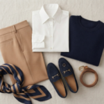
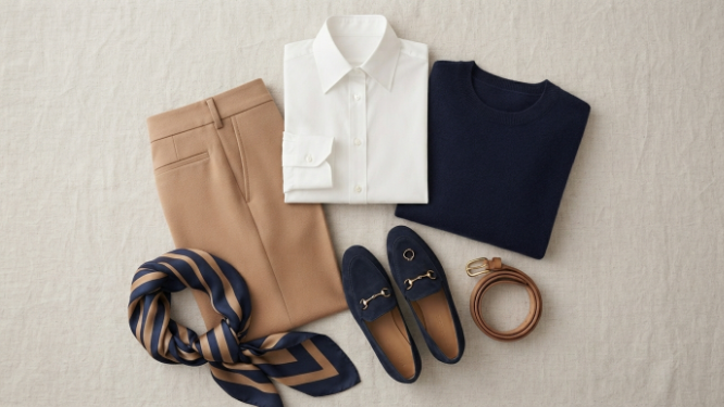
1. Navy and White Crisp, high contrast, works basically year-round. Navy does what black does — depth, seriousness — without feeling as severe. It’s softer, more forgiving, easier to layer with.
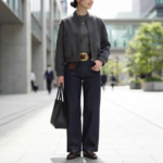
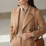
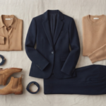
2. Black and Camel This is the one I reach for most. Black keeps it grounded, camel adds warmth, and somehow the combo reads as more expensive than either color alone. Works dressed up, works dressed down.
3. Olive Green and Burgundy Both earthy, both deep — this one’s built for fall and winter. Green’s coolness against burgundy’s red undertone gives it visual texture without ever looking chaotic.
4. Gray and Blush Pink Gray can feel a little flat on its own. Add blush pink and suddenly it’s warm and approachable instead of corporate. Good for business casual, good for a weekend brunch.
5. Denim Blue and Rust Cool blue meets warm orange-rust. It looks like you tried without looking like you tried too hard, which is honestly the whole goal of getting dressed.
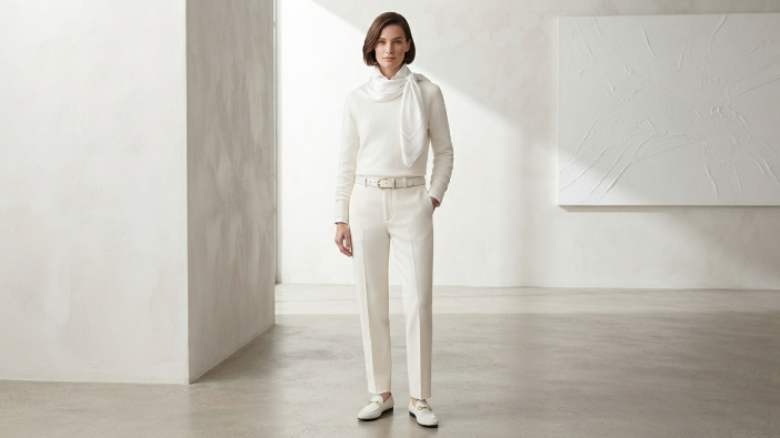
6. All-White Monochrome Full white, but leaning on texture and slight tonal shifts instead of pattern. Reads clean, intentional, a little elevated. Best in warmer months, obviously.
7. Charcoal and Mustard Charcoal stays quiet so mustard gets to do the talking. Feels current without tipping into “trying too hard to be trendy.”
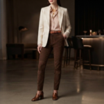
8. Cream and Chocolate Brown This combo has had a real moment lately, and I get why — it’s warm, it’s sophisticated, and it survives the transition from linen in July to sweaters in December.
9. Navy and Burgundy Two deep, rich tones that read jewel-toned together. This is your dinner-out combo, your slightly-dressed-up combo.
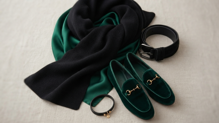
10. Black and Emerald Green Emerald against black looks expensive with zero extra effort. You don’t need accessories to make this pop — it just does.
11. Beige and Sky Blue Soft, quiet, a little airy. This is a spring and summer pairing through and through.
12. Terracotta and Sage Green Both muted and earthy, and this pairing has quietly taken over the last few seasons. Especially good with linen or cotton — there’s a grounded, natural feel to it that synthetic fabrics just don’t replicate as well.
Tips I’ve Picked Up Along the Way
- Anchor with a neutral. Black, white, navy, gray, camel — pick one and build around it. It keeps everything else from feeling like it’s competing.
- Cap it at two or three colors. More than that and an outfit starts to look accidental instead of intentional.
- The 60-30-10 split. Dominant color gets about 60%, secondary gets 30%, and your accent color gets the last 10%. It’s a rough guide, not a rulebook, but it works more often than not.
- Know your undertone. Warm undertones tend to glow in earthy combos — think terracotta and sage. Cool undertones usually do better in jewel tones like emerald and navy. Worth experimenting to see what’s actually true for you, not just what’s trending.
- Don’t be scared of contrast. Black and emerald together is a bold move, but it looks polished, not chaotic, as long as the rest of the outfit stays simple.
- Let accessories echo the palette. A bag or a pair of shoes in one of your outfit’s colors ties the whole thing together — small move, big payoff.
- Take a photo before you leave. I do this constantly. Something that looks fine in the mirror sometimes clashes the second it hits a camera. Two seconds, saves you from a bad photo later.
Mistakes I See Constantly
- Piling on too many colors at once and ending up with visual noise instead of a look.
- Ignoring undertone entirely, which is how you end up in a color that technically “matches” but still looks off on you.
- Defaulting to black every single time instead of branching into navy, camel, or gray, which honestly give you more range.
- Avoiding color altogether because you’re not sure how to combine it — even one confident accent color can change an entire outfit.
- Forgetting accessories are part of the color story too, not an afterthought tacked on at the end.
Final Thoughts
You can transform your entire wardrobe without buying a single new item, just by getting intentional about color.
In my experience, this one shift does more for how “put-together” you look than almost anything else — more than a new haircut, more than a new bag, more than most of the stuff people actually spend money on.
Pick two or three of these combinations and just wear them for a couple weeks. Don’t try to master all twelve at once — that’s how you end up back at square one, staring at your closet.
Let the ones that get compliments, or just make you feel like yourself, become your default. That’s really all a personal style is: a short list of things that work, repeated with confidence.
FAQ
What are the safest color combinations for clothes?
Navy and white, black and camel, gray and blush pink. All reliable, all versatile, all hard to mess up.
How many colors should one outfit have?
Two to three is the sweet spot. The 60-30-10 rule keeps it balanced without overthinking it.
Do neutrals count as a color combination?
Yes. Pairing black with camel or gray with white still takes intention — it’s not a cop-out, it’s a strategy.
How do I figure out what actually flatters me?
Start with undertone. Warm undertones usually do well with earthy colors, cool undertones tend to lean into jewel tones and blues. Worth testing rather than assuming.
Can bold color combos work for the office?
Yes, as long as you’re pairing the bold piece with neutrals around it. One loud color plus quiet supporting pieces reads as intentional, not chaotic.
What’s the low-risk way to start experimenting?
Accessories first. A colored bag or scarf lets you test a combo without committing to a whole outfit.
Do these trends shift by season?
Some do — certain pairings get more popular in a given year. But the foundational ones, like navy and white, never really go out of style.